Design for Social Good

GreenSpaces
BACKGROUND
Prompt
As part of the final project of the Coursera Google UX Design Certificate program, we were asked to identify a social need in our community and design a solution (across a dedicated app & a responsive website) to address this issue. As someone who lives in the city, and has often lived without a car or other reliable transportation, the prompt I developed was...
Design a tool that helps people find green space near them to promote outdoor activities and wellbeing...
Process

RESEARCH
Users
After extensive research, it was clear that a tool like this could be helpful in reducing inequality by encouraging millions of people to engage with their natural surroundings, ultimately improving their physical and mental wellbeing. What wasn't clear was who the app would service. After several interviews and a comprehensive review of 3rd party research, I developed the below personas.
Some common themes amongst our potential users were:
Limited access to transportation and/or mobility issues generally make people think they can't access nature.
Unfamiliar activities & unaffordable gear turn people away from certain parks/spaces.
Many parks & natural spaces are hidden in urban environments and aren't easily searchable given today's tools.


Competitive Analysis
After digging into potential users of the app, I evaluated the competitive landscape. There are several apps and websites that service the needs of our users. However there are no existing platforms that aggregate the type of information that our users need.
The apps that were reviewed were Google Maps & The Hiking Project and the responsive websites we reviewed were Find Your Park & City of Seattle Parks Finder.

Opportunities
Optimize the app and website for accessibility by including, at minimum: robust images throughout, accessibility-friendly color options, and screen reader-compatibility, in addition to easily-recognizable symbols and icons
Be strategic in creating the website and app’s information architecture and make sure that it serves user needs
Clearly label buttons and icons
Develop a strong brand identity that is consistent between desktop and mobile
DESIGN
Because this project includes both a native app and a responsive website, I had to decide how I would be designing (progressive enhancement or graceful degradation). After careful review of our users and our applications goals, I determined a mobile-first, progressive enhancement approach would be best. Designing for the smallest screens available would ensure the app was equitable and available for people regardless of device.
Mobile First
After thoroughly researching our potential users and the competitive landscape, I used the Crazy 8's method to quickly ideate some potential designs. I chose the Crazy 8's method to challenge myself to think outside the box and come up with a plethora of options to pick and choose from.
Crazy 8’s
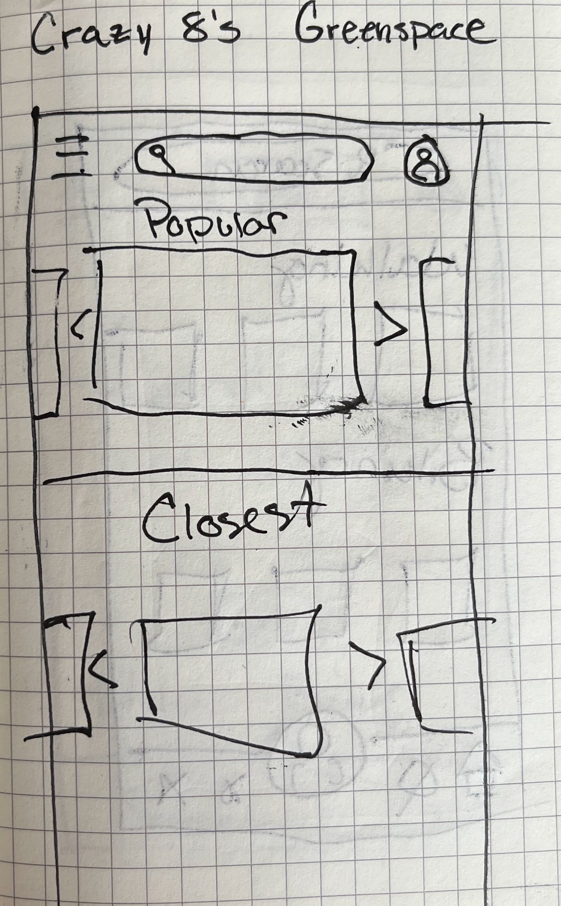
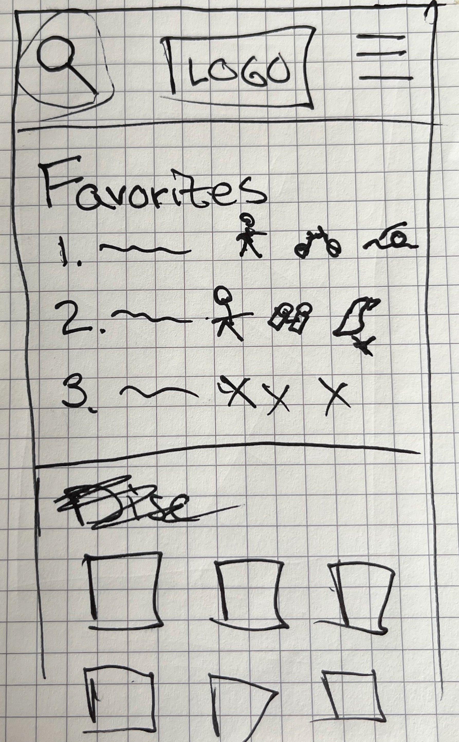
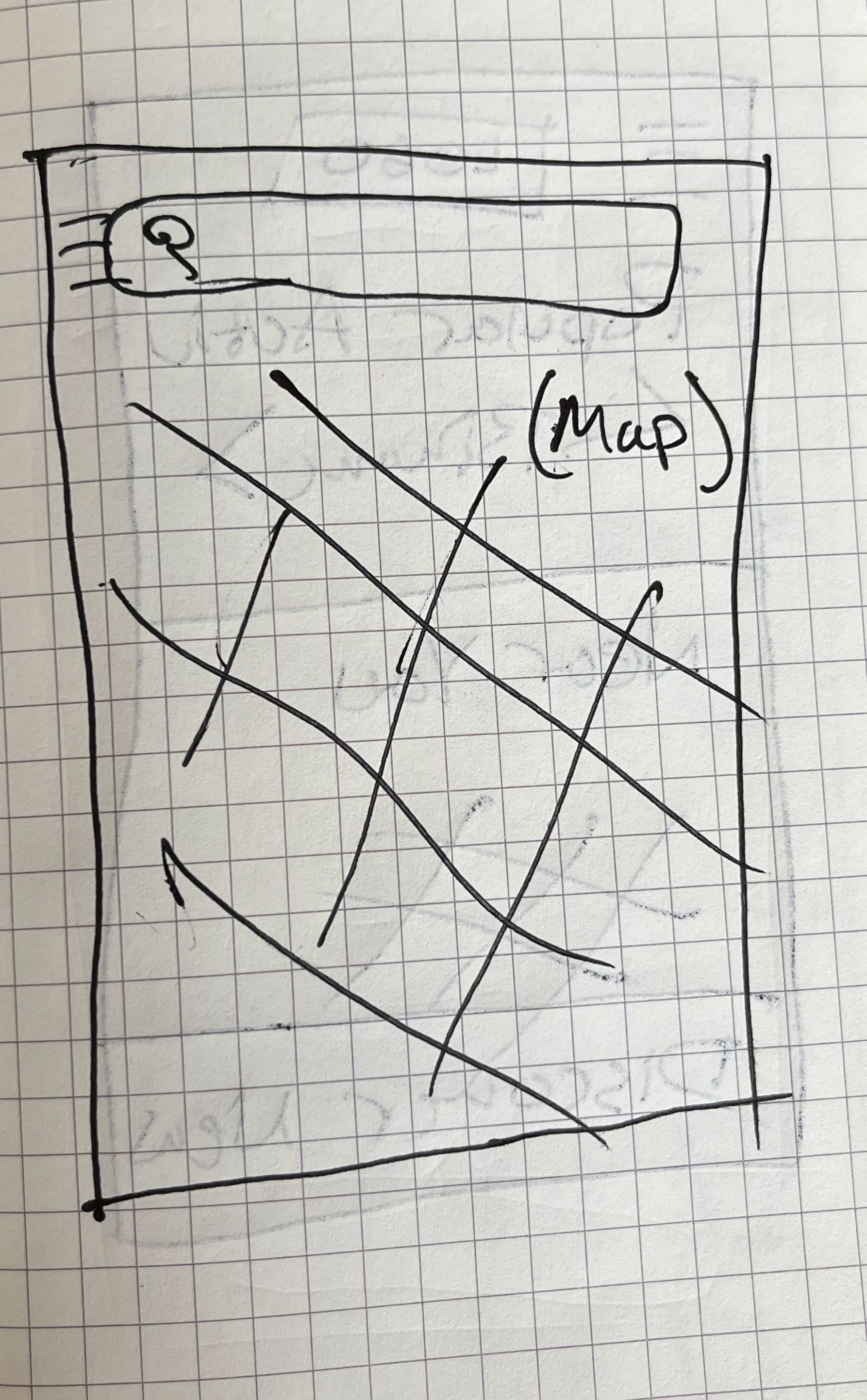


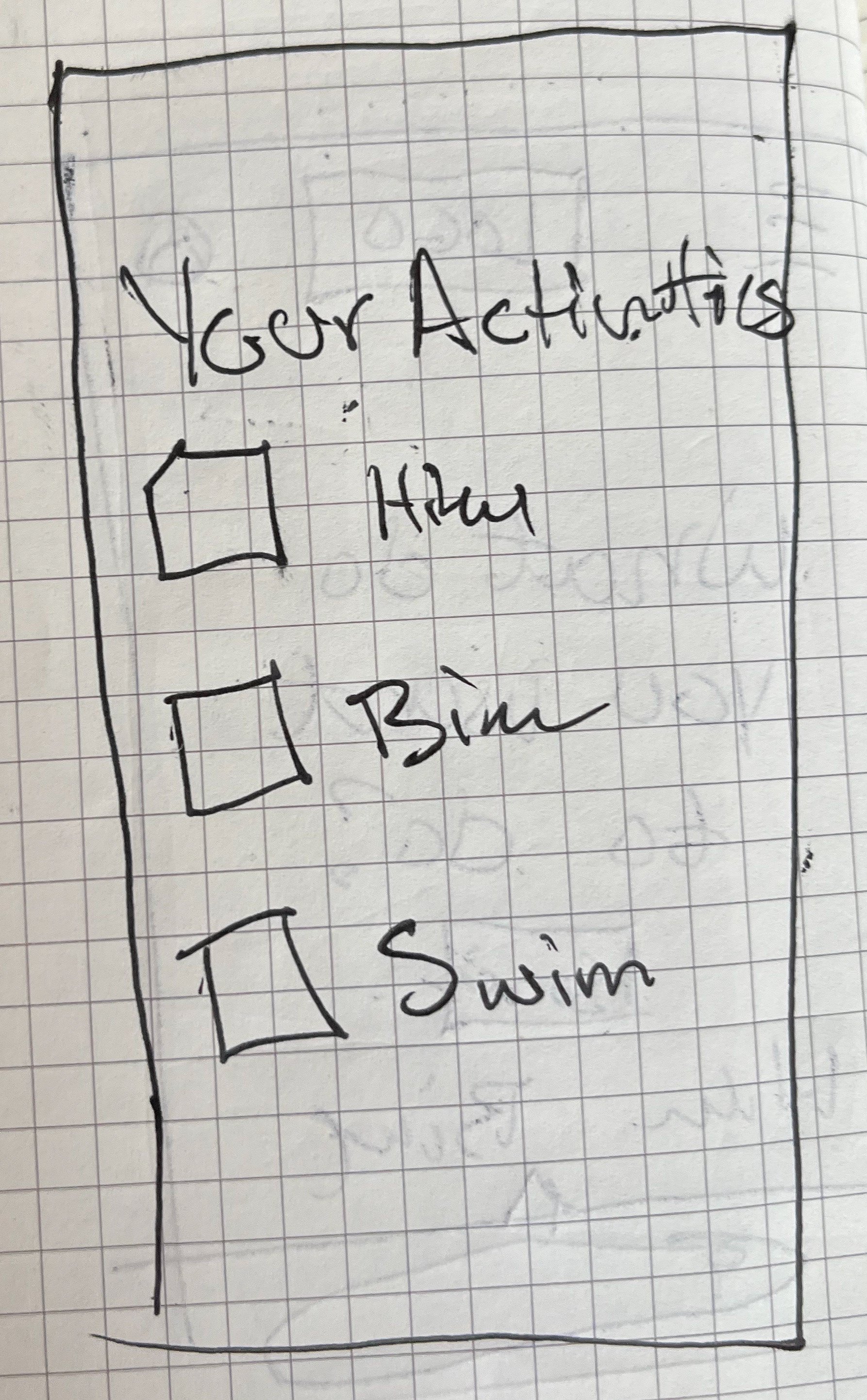

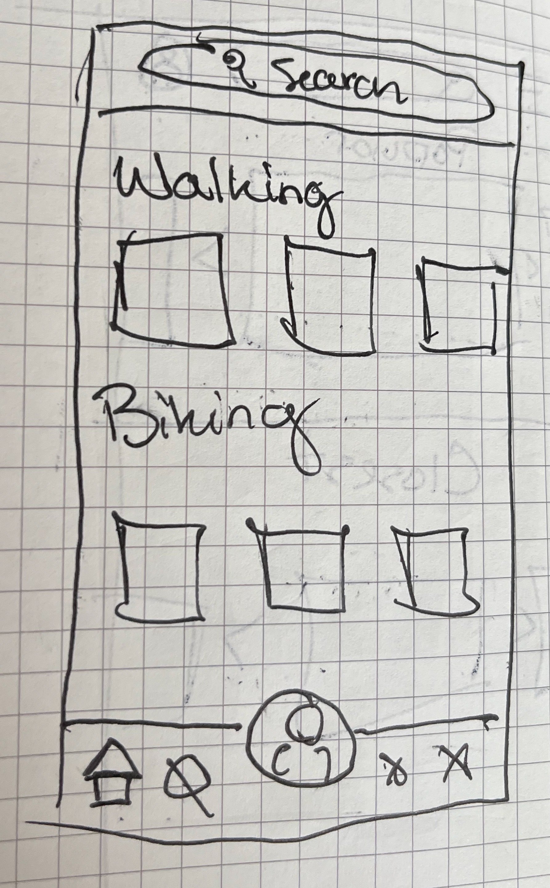
With a suite of ideas developed during the Crazy 8's exercise, and a clear mandate to design for mobile devices first, I began digital wireframes of the application. These quickly came to life and were used in introductory testing with potential users. A few challenges I faced:
My own bias was clear in the development of this application. Many of the potential activities I had listed were geared towards younger, more active people. Thinking about other filters, activities and other needs for the community, I began pulling in a diverse cast of people to help ensure the app was more welcoming to all (exs. dog-friendly, playgrounds, fishing, etc.)
Many users felt they were missing reviews by their peers. Having star ratings was helpful in navigating the app, but when viewing more detailed pages, they wanted to see the latest reviews and input.
Understanding the costs associated with each space was important, so adding filters for price was added as a solution to later designs.
Wireframes


User input informed several enhancements to the wireframes. With that in mind, I began designing the High Fidelity prototype for the mobile application.
Introducing the GreenSpaces app, specifically designed to connect you with the private, city, county, state and National Parks closest to you.
Hi-Fi
After development of the mobile app and some light user testing, I designed the homepage for the responsive website. I started with the mobile version to ensure I was following the principles of progressive enhancement before applying the designs to a desktop format.
Responsive Web Design


FUTURE CONSIDERATIONS
The high-fidelity prototype above was the culmination of several months of study and practice. While this fulfilled the requested deliverables of the course, there are several steps I would take if this were to go into actual development:
Accessibility checks on colors and designs to ensure maximum compatibility and use for our diverse users.
User Testing of additional designs & prototypes. In order to ensure the app is designed for all types of users and fulfills all of their needs, I would conduct additional tests, with more users, across more pages.
Further Development of the responsive website to ensure functionality works across devices and sizes. Use of auto-layouts as well to make certain this scales properly.
