Responsive Web Design Study
Patisserie Lyonnaise

BACKGROUND
Prompt
As part of the Coursera Google UX Design Certificate program, I was assigned a unique prompt that was the foundation of my responsive design project. I applied the basic foundational UX concepts learned in the first half of the course to create a simple and effective solution that scaled between devices. For this particular project, my prompt was...
Design a shopping experience for a French Patisserie…
Process

While I followed the design process, from empathizing to testing, the main focus of this project was designing a responsive website and ensuring the experience translated to multiple devices.
As of 2022, more than 60% of all web traffic was via a mobile phone. While most mobile web traffic is focused in the developing world, more than 90% of users worldwide have admitted to using a mobile phone to access the internet.
I focused on developing a desktop website first before designing for mobile per the course instruction. In hindsight, this exercise should have been reversed, focusing on the emerging mobile requirements and developing a desktop version from that. I'll dive deeper into this in the future considerations section below.
62%
of all web traffic worldwide is mobile*
*https://explodingtopics.com/blog/mobile-internet-traffic
RESEARCH
Users
Every experience design project starts with our users. The below user personas were developed after interviews with customers. I also had a unique opportunity to work hand-in-hand with a close associate who is a French Pastry chef, operating a French Patisserie here in the US.
The overarching needs of our consumers were around simplicity and convenience. It was critical for them to be able to peruse and customize their orders, including pickup time, based on their personal needs.


Competitive Analysis
With a good handle on our potential users and their needs, I shifted focus to the competitive landscape. Looking at a mix of direct competitors, related apps and leaders in the design space, clear opportunities and best practices were identified. The apps that were reviewed were:
Patisserie Coralie: A self-proclaimed French Bakery & Coffee shop located in the heart of downtown Evanston, IL. This shop offers pastries, sandwiches & beverages for dine-in and to take. They are a direct competitor to our business.
Bakery Nouveau: A small Bakery with French roots but very much rooted in American cuisine, located in the central retail area of West Seattle, WA. This shop offers pastries, sandwiches & beverages to take only. They are a direct competitor to our business.
Ma-ka-rohn: An online-only retailer. This group specializes in macarons specifically, but overs a robust online ordering system to maximize customizations. This is an indirect competitor.
DoorDash: An aggregator of restaurants, DoorDash has a national profile, offering online/app ordering for pickup and to take. This is an indirect competitor.
After reviewing the competitors, several opportunities were identified, both in design of our experience and in the offerings the business provides. These are outlined below.

Opportunities
Simplify the shopping experience while providing engaging copy nods and images to drive consumer interest.
Ensure consistent tone & branding throughout the experience to build more brand recognition.
Design around user behavior. Specifically, structure the nav around key actions that users want to take (i.e. make the Menus and Order Now functionality easy to access).
DESIGN

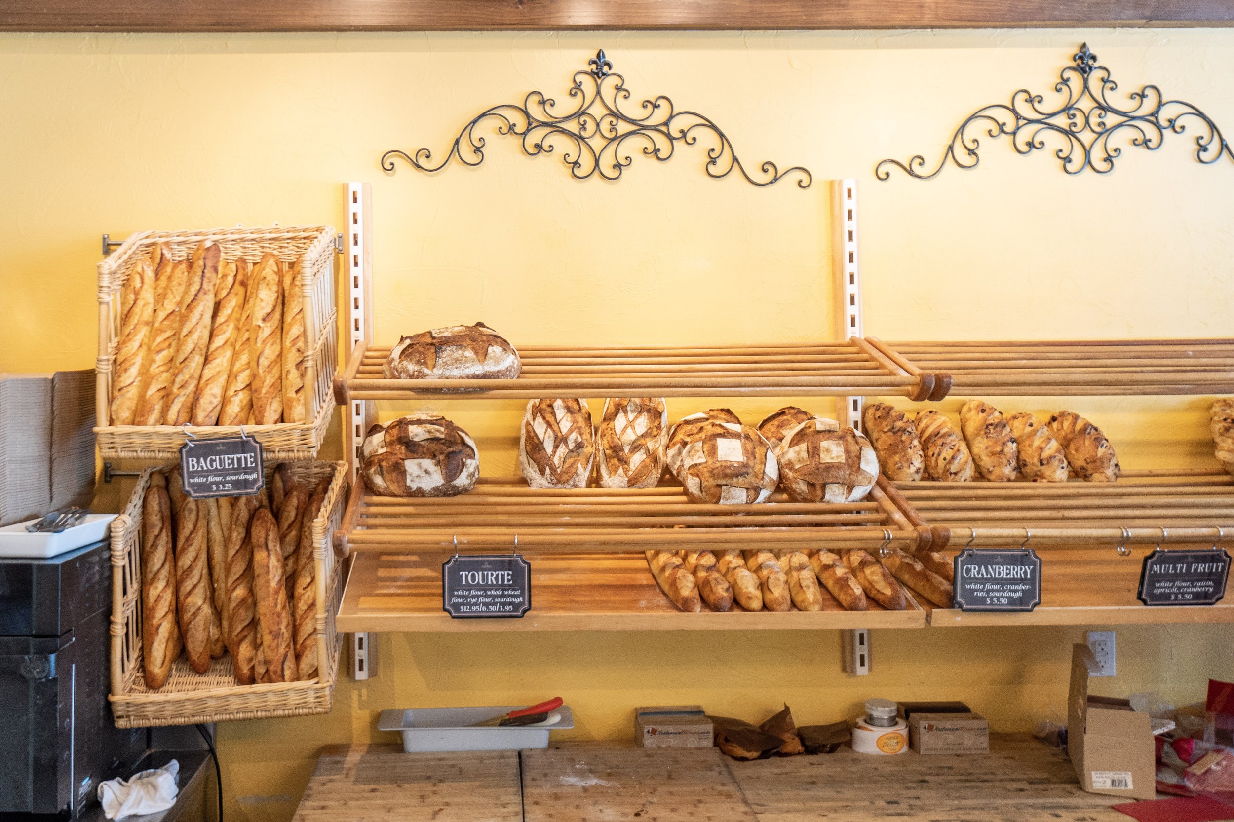
Designed with simplicity in mind, this was modeled off the best practices seen across our competitors, and based on the needs of our specific user group.
Information Architecture
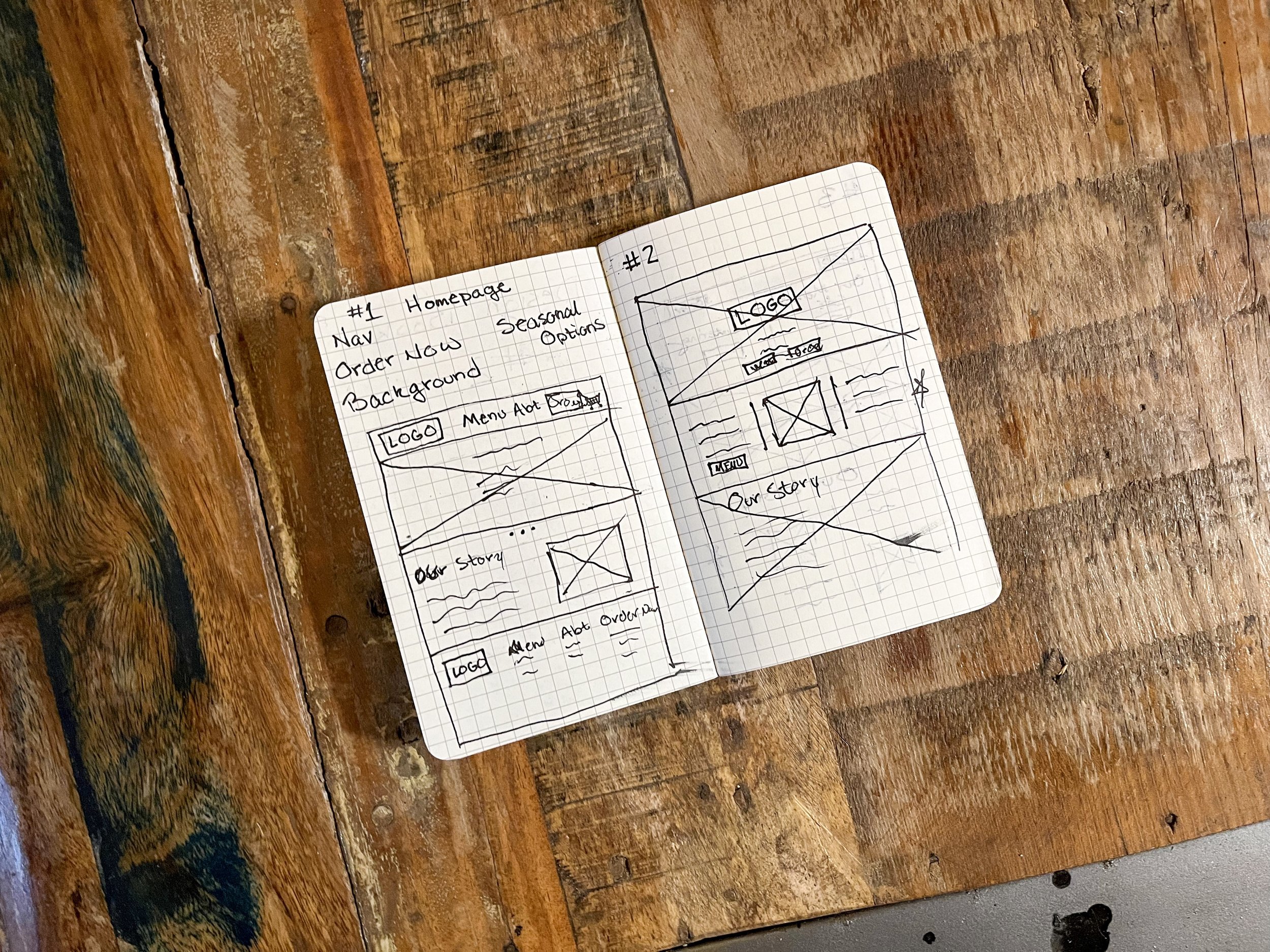
Developed through the Crazy 8's process, several experimental wireframes were pulled together that informed later designs. Some of the winning ideas were versioned across devices to ensure compatibility across screen sizes.
Wireframes
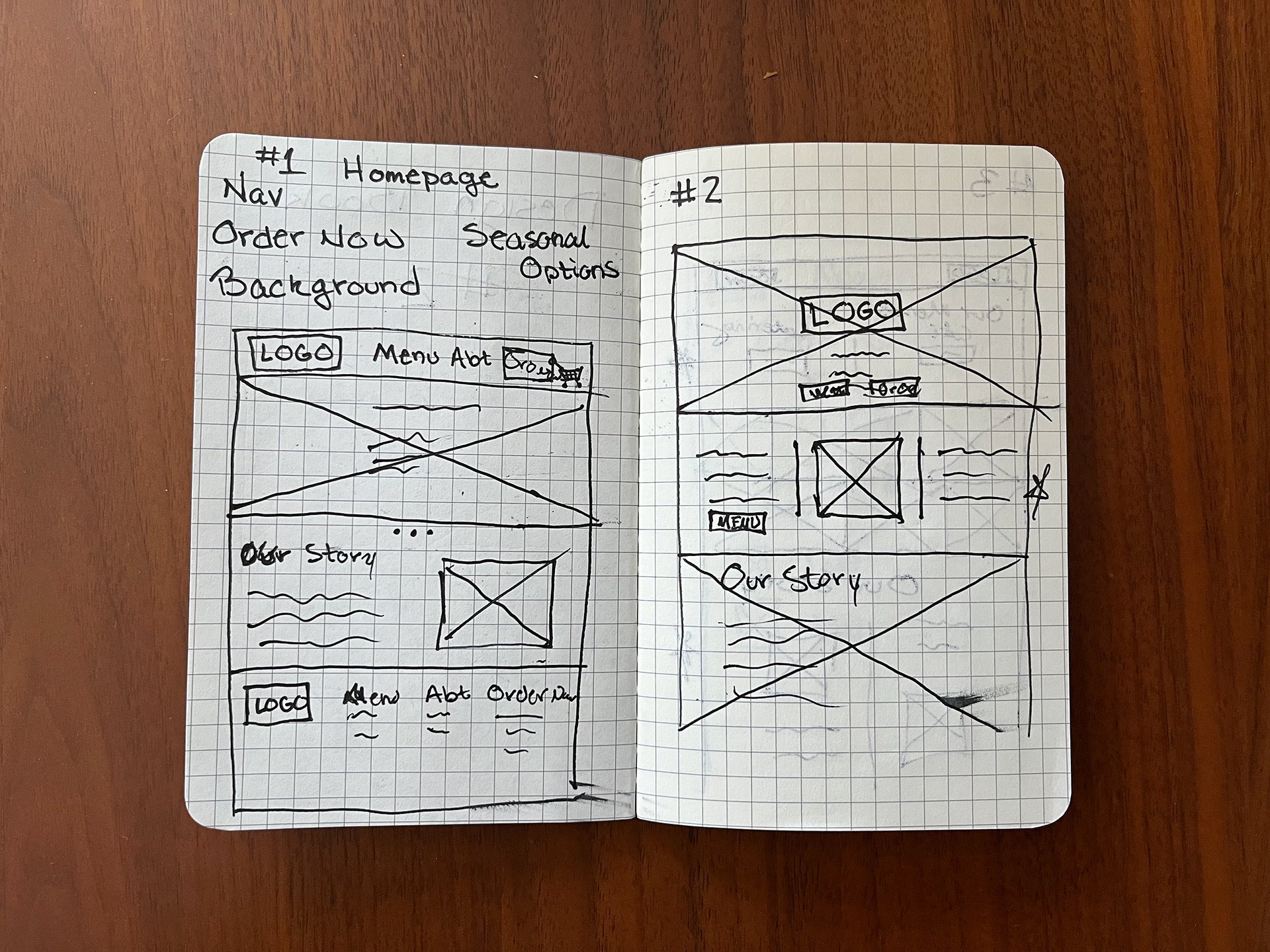
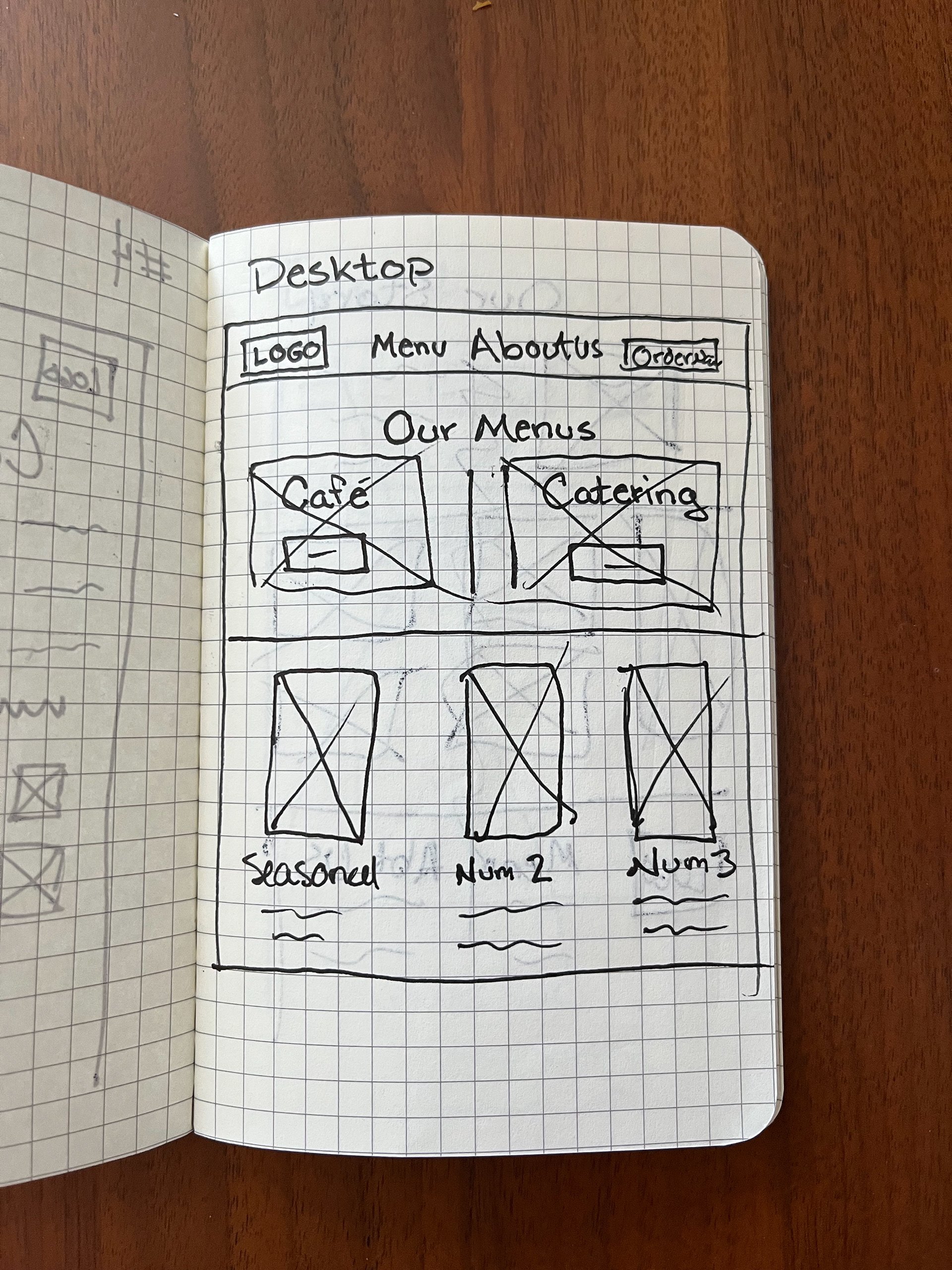


With storyboards complete and users' needs documented, I began designing low fidelity wireframes. Once complete, these were animated and turned into prototypes.
Lo-Fi Prototyping
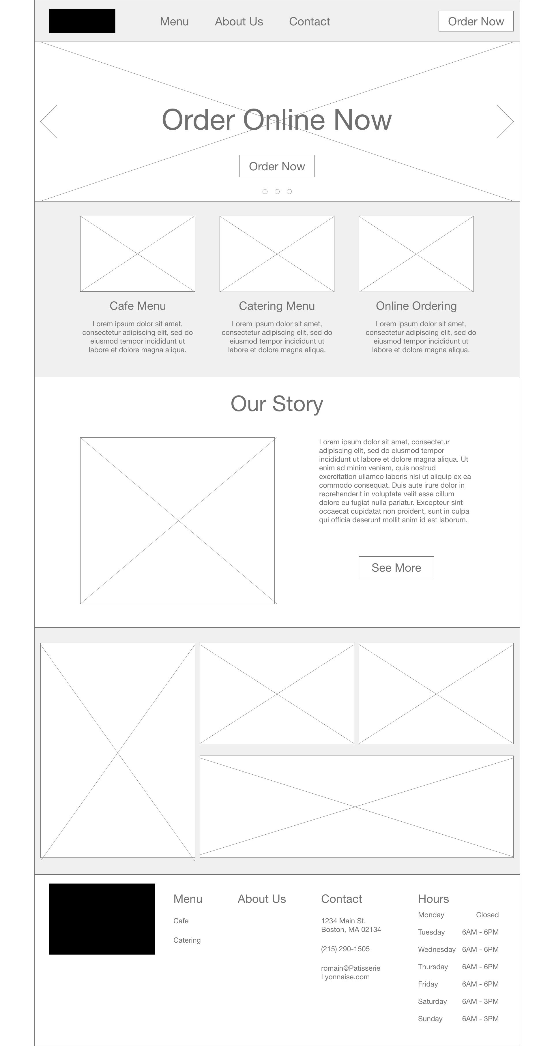
Before diving into the high-fidelity designs, I spent time ideating a business name and identity. Below are the foundational elements that helped drive the brand identity exploration and the final logo/wordmark.
Brand Foundations
Immersed in French culture & tradition, specifically Lyon
Approachable & authentic tone
Lets the Food shine
Branding


With a clear brand identity, extensive wireframes and a holistic low fidelity prototype, I embarked on the responsive web design, bring both desktop and mobile designs to life. Final designs and links to prototypes can be found below.
Hi-Fi Prototyping
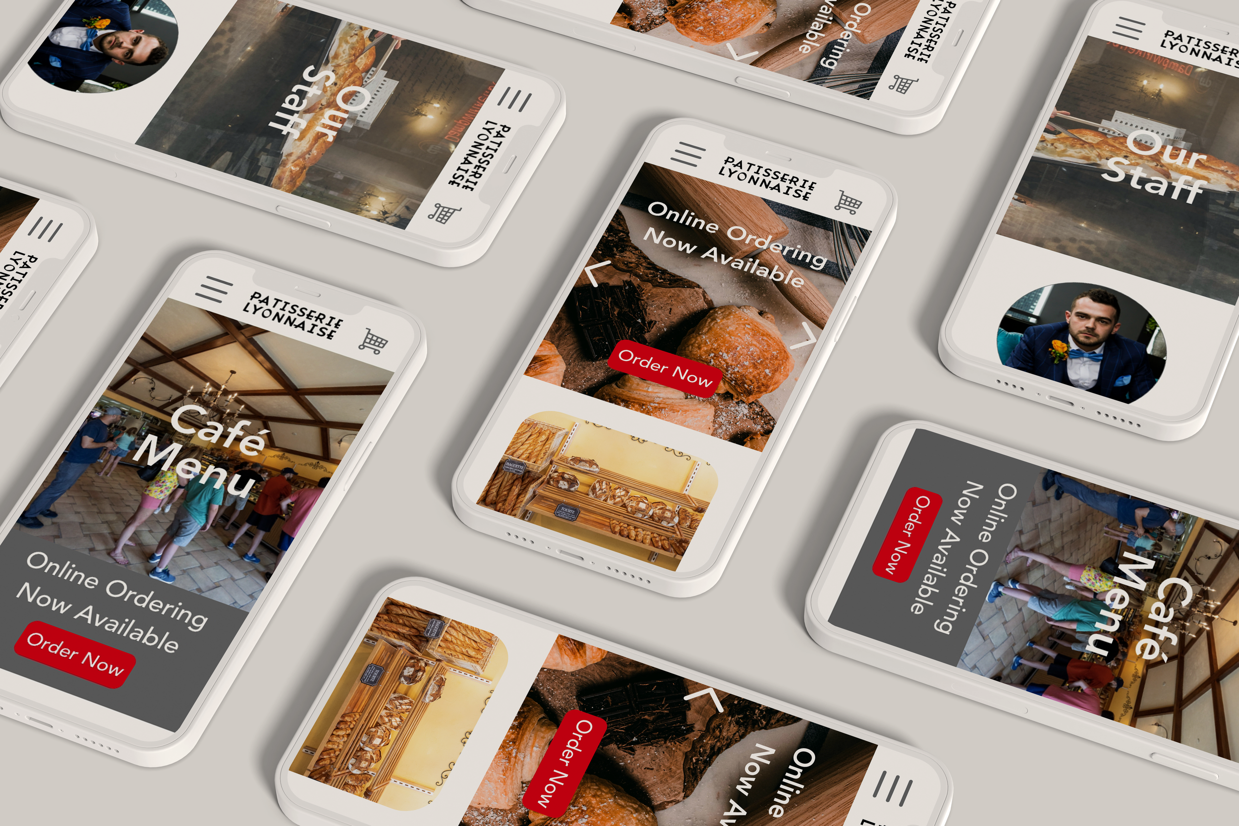
FUTURE CONSIDERATIONS
The high-fidelity prototype above was the culmination of several months of study and practice. While this fulfilled the requested deliverables of the course, there are several steps I would take if this were to go into actual development:
Accessibility checks on colors and designs to ensure maximum compatibility and use for our diverse users.
User Testing of additional designs & prototypes. In order to ensure the app is designed for all types of users and fulfills all of their needs, I would conduct additional tests, with more users, across more pages.
Simplification of the process to add, update and reuse content by leveraging built in tools. Knowing that menu items change a lot, it's important to build a simple, easy-to-use system that allows updates across the site.
