Event Check-In Mobile App

The Dojo
BACKGROUND
Prompt
As part of the Coursera Google UX Design Certificate program, I was randomly assigned a prompt that was the foundation of my class project and guided me through the design process: from empathizing with users to testing and iterating on designs. Throughout the development of this app, I learned the basics of UX research and applied foundational UX concepts, like user-centered design, accessibility, and equity-focused design to create a simple and effective solution. The prompt was...
Design a special event check-in app for an arcade…
Process

I followed the design thinking process, from interviewing users & developing personas to building high fidelity prototypes & conducting moderated user tests. While there were many components of the app I could have explored, I decided to focus my efforts on the check-in process specifically.

RESEARCH
Users
The first step in the design process was identifying and interviewing potential users of the app. In this scenario, without access to real users, I developed several POVs, of varying backgrounds and ages, and conducted faux interviews to begin understanding the needs, wants and general behaviors of our potential users.
Those interviews were reviewed, analyzed and condensed into two unique Personas, each with their own perspectives on the current check-in process at their favorite arcade.
“Long lines can turn an experience sour, especially when people cut them”
“Resubmitting information more than once, especially in this digital day & age, can be especially frustrating”
“Going out is very different than it used to be. Having to use my phone to access events can be challenging”
“While living in the United States for many years now, some cultural and language barriers do still exist.”
User Quotes


Competitive Analysis
With a good handle on our potential users and their needs, I shifted focus to the competitive landscape. Looking at a mix of direct competitors, related apps and leaders in the design space, clear opportunities and best practices were identified. The apps that were reviewed were Eventbrite, Ticketmaster & Conference Attendee.
The opportunities, as outlined below, were just some of the learnings pulled from the competitive analysis. Ultimately, it came down to ensuring users had multiple ways to access their information, whether that be for the event or the venue in general.


To build on the learnings from our user interviews, we mapped a typical user journey, charting the physical tasks completed with the emotional experience of a typical user. Combining all of the research done to date, a clear set of unique values were uncovered. Below is a snapshot of the journey, with key features and opportunities laid out for each stage of the journey. By providing information about the entire process, from travel, to final check-in and ultimately seating, we can alleviate a lot of stress for our users and simplify the check-in process.
Value Proposition


DESIGN
We developed storyboards to organize the general flow of the app. By developing both Big Picture & Close Up storyboards, we were able to explore multiple angles of the app and illustrate different use cases.
Storyboards


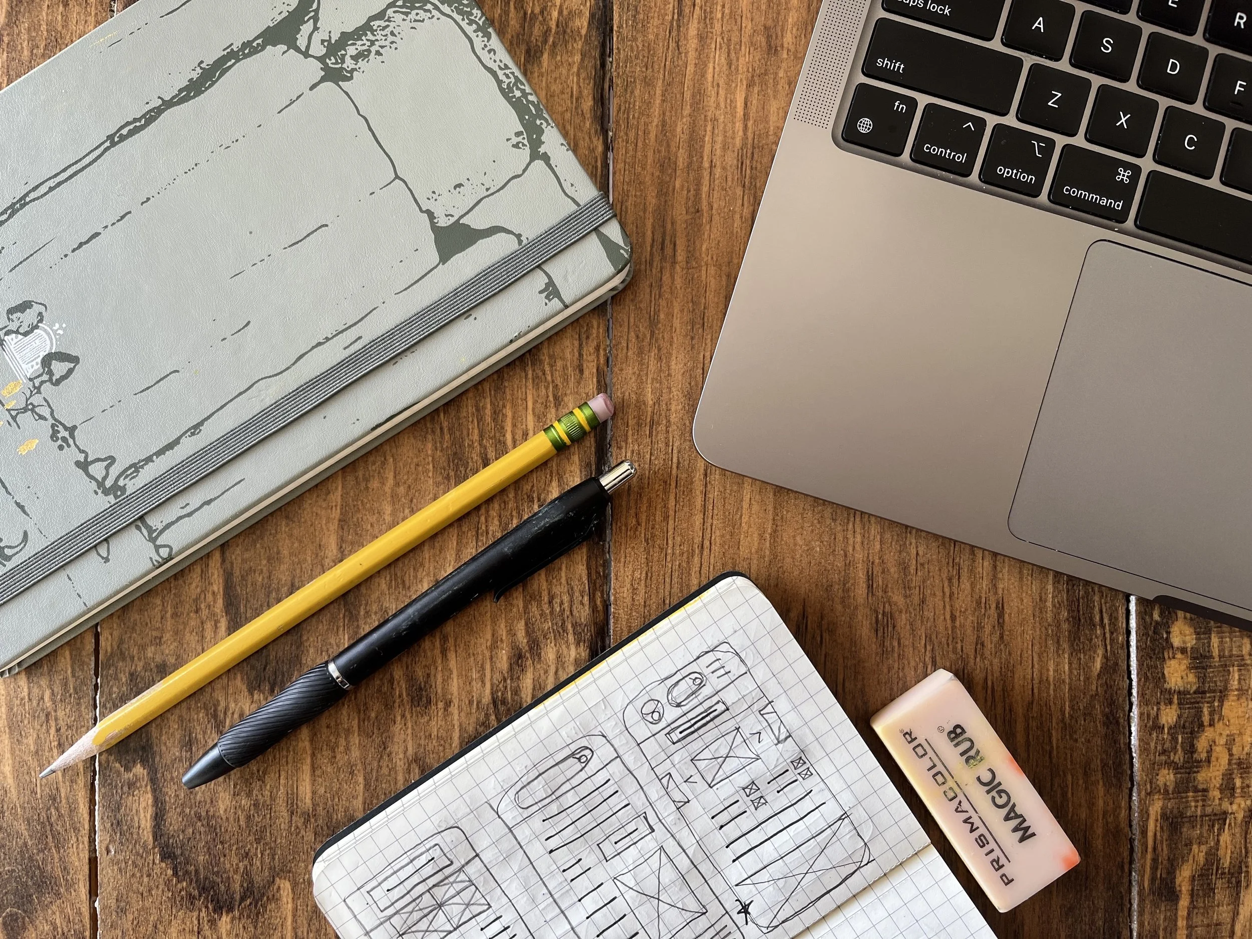
With storyboards complete and users' needs documented, I began designing low fidelity wireframes. Once complete, these were animated and turned into prototypes.
Lo-Fi
After development of the low-fidelity prototype, I began a series of user tests to determine if our app was effective and how we could improve on it. Subjects were sourced from different backgrounds, genders and ethnicities to ensure a more equitable experience for all of our potential users. The research provided clear feedback on the experience, as detailed below. This allowed me to adjust wireframes before moving into high-fidelity designs.
User Testing


Around three months after the start of this course, I finished the high-fidelity design of my Special Event Check-in App. The faux arcade app, now branded as "The Dojo" in honor of Street Fighter, allows a user to check-in to their event, and access all of the information they need for said event. By building on all of our previous research and the learnings from our user testing, I was able to build an app that delivered on users' needs.
Hi-Fi
Key to development of the final product was the visual design system. The below basics helped me create a consistent experience for our users.
Visual Design System

FUTURE CONSIDERATIONS
The high-fidelity prototype above was the culmination of several months of study and practice. While this fulfilled the requested deliverables of the course, there are several steps I would take if this were to go into actual development:
Accessibility checks on colors and designs to ensure maximum compatibility and use for our diverse users.
User Testing of additional designs & prototypes. In order to ensure the app is designed for all types of users and fulfills all of their needs, I would conduct additional tests, with more users, across more pages.
Design Development of the rest of the functionality. While we've created placements for several key functions (like addition to a users' calendar), the designs haven't been fully fleshed out.
Further Development of the Visual Design System to ensure consistency across the rest of the app. This will ensure a consistent flow for users, reduce confusion and ultimately create a better experience.
